Customer Onboarding (Version 2.0)
Guide first-time app users with a customizable onboarding flow that boosts engagement using welcome screens, permissions prompts, and sign-up options.
![]() Written by Reactiv App
Written by Reactiv App
Overview
The Customer Onboarding feature introduces a modern, branded welcome experience for new app users. It includes:
-
Age Verification Screen
-
Welcome Screen
-
Push Notification Opt-in
-
Location Services Opt-in
-
App Tracking Transparency (optional)
-
Sign Up / Sign In
-
Location Services (new)
This updated version (2.0) includes sleek new designs, support for custom media, and the new Location Services screen.
⚠️ Once you upgrade to Version 2.0, you cannot return to 1.0, which will be sunset in the future.
Enabling Customer Onboarding
-
In the Reactiv Dashboard, go to App Studio > Customer Onboarding from the screen drop-down.
-
Toggle Enable customer onboarding.
-
Select Version 2.0.
-
Click Save.

Once enabled, you can edit each onboarding screen individually.
Screen-by-Screen Setup
Age Verification Screen
If this screen is enabled, it automatically becomes the first screen in your onboarding flow, appearing before all other screens.
How to Enable the Age Verification Screen
-
In your Shopify admin, open the Reactiv Mobile sales channel.
-
Click the Reactiv logo in the App Studio to access your app settings.
-
Go to Customer Onboarding in the left-hand menu.
-
Scroll to the Onboarding Screens section.
-
Toggle Age Verification on to activate the screen.
To preview it, select Age Verification from the Preview Screen dropdown.
Customization Options
The Age Verification screen uses the same design components as your other onboarding screens, keeping the overall experience consistent with your branding. You can edit:

-
Title
Customize the headline that appears at the top of the screen. -
Legal Text
Add up to 250 characters of legally required wording. Rich text formatting is supported so you can style the message to fit your brand. -
Minimum Age Requirement
Set the minimum age a shopper must meet to enter the app (e.g., 21). -
Button Label
Set the call-to-action button text, such as “Enter” or “Continue”. -
Footer Text
Include any additional legal statements or disclaimers required by your region.
Your changes will appear in real time in the preview panel.

Welcome Screen
-
First screen shoppers see.
-
Logo: Toggle to show your logo across all onboarding screens.
-
Background options:
-
No background (minimal).
-
Splash image (from App Settings).
-
Custom image or GIF (upload file or paste media URL).
-
-
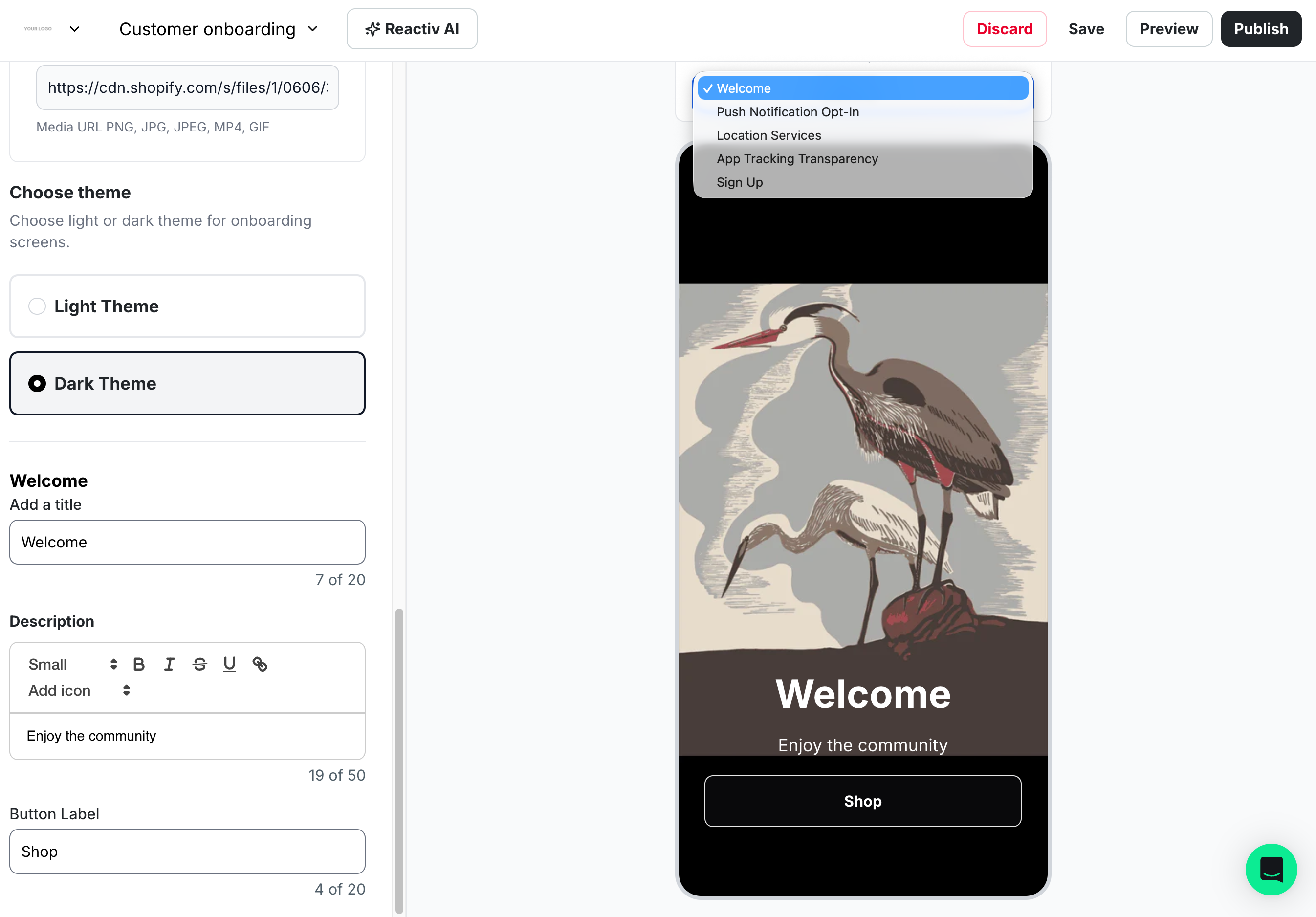
Theme: Choosing a theme in this screen only changes the colour of the Call to Action button, and the text within it, background text and image are unaffected:
-
Light theme: white call to action button, with black text.
-
Dark theme: black call to action button, with white text (pictured below).
-
📝 Note: icons are not currently supported in the Customer onboarding flow.

Push Notification Opt-in
-
Uses device’s native notification prompt.
-
Logo and background settings carry forward.
-
Text fields:
-
Title (20 characters).
-
Description (50 characters).
-
Button label (20 characters).
-
-
Theme: Theme changes only affect the Sheet and Call to Action containers. Choosing a theme changes a sheet colour, button colour, and text colour in those containers for accessibility and visibility.
-
Light theme: white sheet, black text within the sheet, black button with white text.
-
Dark theme: black sheet, white text within the sheet, white button with black text.
-
Location Services Opt-in (New)
-
Uses device’s native location prompt.
-
Logo and background settings carry forward.
-
Text fields:
-
Title (20 characters).
-
Description (50 characters).
-
Button label (20 characters).
-
-
Theme: Theme changes only affect the Sheet and Call to Action containers. Choosing a theme changes a sheet colour, button colour, and text colour in those containers for accessibility and visibility.
-
Light theme: white sheet, black text within the sheet, black button with white text (pictured below).
-
Dark theme: black sheet, white text within the sheet, white button with black text.
-

App Tracking Transparency (Optional)
-
Uses device’s native tracking permission prompt.
-
Can be toggled on or off in onboarding flow.
-
Logo and background settings carry forward.
-
Text fields:
-
Title (20 characters).
-
Description (50 characters).
-
Button label (20 characters).
-
-
Theme: Theme changes only affect the Sheet and Call to Action containers. Choosing a theme changes a sheet colour, button colour, and text colour in those containers for accessibility and visibility.
-
Light theme: white sheet, black text within the sheet, black button with white text.
-
Dark theme: black sheet, white text within the sheet, white button with black text (pictured below).
-

Sign Up / Sign In Screen
-
Allows shoppers to create or access accounts.
-
Logo and background settings carry forward.
-
Text fields:
-
Title (20 characters).
-
Description (50 characters).
-
Button label (20 characters).
-
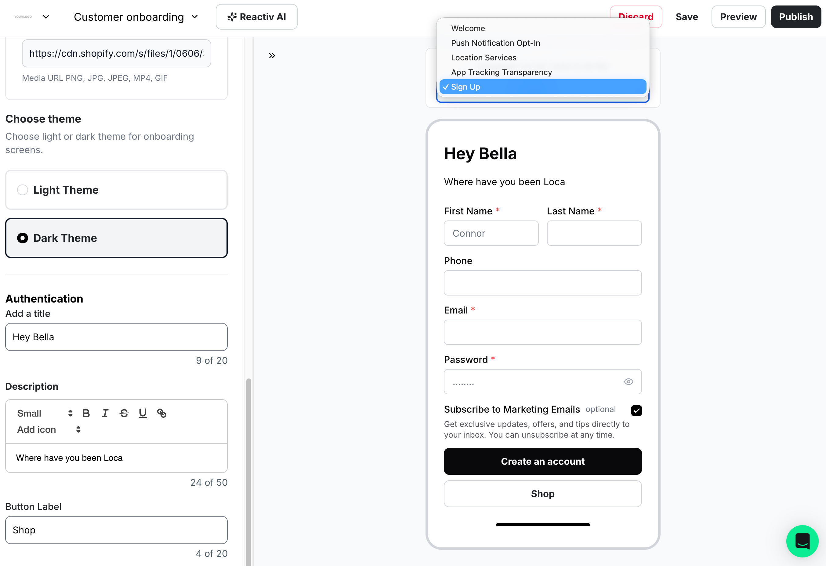
What shoppers see depends on your Shopify account setup:
-
Legacy Customer Accounts:
-
Name, phone, email, password, and email marketing opt-in.
-

-
New Shopify Customer Accounts:
-
Password-less flow (Sign in with Shop is supported).
-
Shoppers can still edit name, email, and address in the app’s Account section.
-
For migration help, see Migrating to Customer Accounts.
-
Best Practices
-
Save changes after editing each screen to avoid losing progress.
-
Use concise, engaging text (titles: 20 chars, descriptions: 50 chars, button labels: 20 chars).
-
Choose visuals (backgrounds, logos, themes) that reinforce your brand identity (We support PNG, JPG, JPEG, and GIF).
Need Help?
If you have questions about enabling Version 2.0 or customizing screens, please contact our support team.
