Product & Collection App Settings
![]() Written by Reactiv App
Written by Reactiv App
How to find this section
-
Log in to your Shopify admin dashboard.
-
In the left-hand sidebar, scroll to the Sales Channels section.
-
Click Reactiv – Mobile App Builder, then select App Studio.
-
Click your company logo at the top of the page and choose App Settings.
-
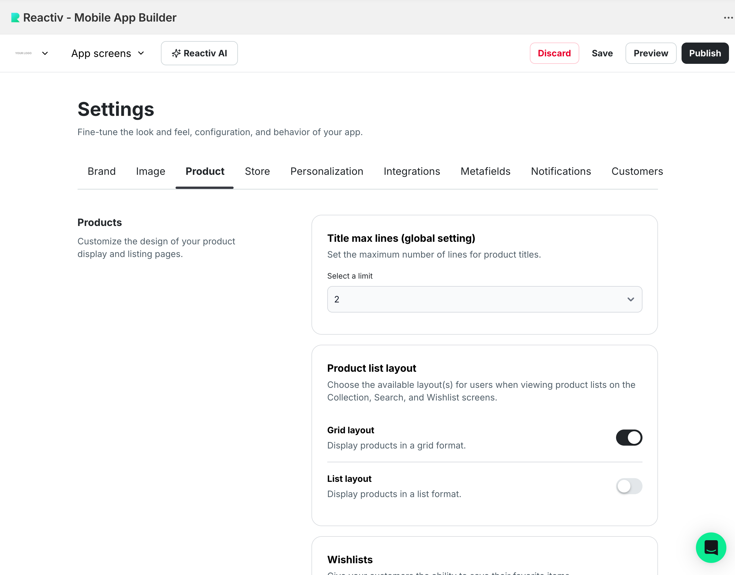
From the top menu, click Product to open Product & Collection App Settings.
Product Settings
These settings control how products display across your app, including product titles, layouts, wishlist behavior, badges, and pricing styles.

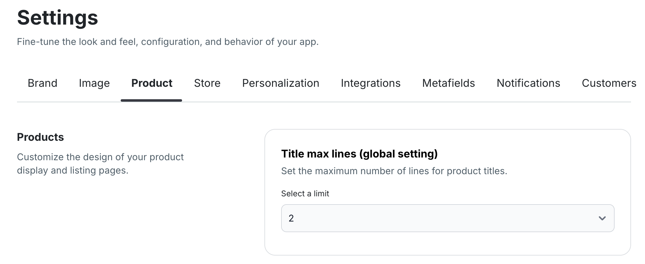
Title Max Lines
Choose how many lines product titles can display on the Product Details Page (PDP).
Use the dropdown menu to select 1 line or 2 lines.
This helps maintain a clean and consistent look for longer product names.

Product List Layouts
Decide how shoppers view products on Collection (PLP), Wishlist, and Search Results pages.
-
Toggle Grid layout (default).
-
Optionally enable List layout.
-
You can enable both, allowing shoppers to switch between layouts.
This provides more flexibility for how products appear in your app.

Wishlist Options
Control where shoppers can add products to their wishlist:
-
Product Details Page (PDP)
-
Product Listing Page (PLP)
-
Or enable both by toggling both options.
This lets you decide how visible and accessible your wishlist feature is to shoppers.

Product Variant Styles
Choose how product variants appear on the Product Details Page (PDP):
-
Buttons – displays variant options as clickable buttons.
-
Dropdown – displays variant options in a dropdown menu.
Select your preferred style by clicking the corresponding option.

Visual Swatches
If your variants use visual representations (like colors or patterns), toggle Visual Swatches on.
Then, choose your preferred swatch style:
-
Buttons
-
Dropdown
-
Circles
This enhances how shoppers see and select product variations.

Product Badges
Highlight key product attributes with Product Badges (maximum of 2 per product).

-
Click + Add Badge to create a new badge.
-
The default text is SALE, but you can edit it using the edit icon.
-
Customize:
-
Background Color
-
Text Color
-
Position (Top Left or Bottom Left)
-
Criteria (e.g., which products display which tags)
-

Badges help call attention to promotions or product highlights.
Product Price Style
Customize how product pricing appears globally in your app. You can adjust:
-
Font Size
-
Text Style (bold, italic, strikethrough, underline)
-
Text Color
-
Dynamic Tokens such as:
-
Product price
-
Compared-at price
-
Product discount
-
This lets you match pricing styles to your brand’s visual identity.
Product Listing Preview
At the bottom of the Product section, you’ll see a live Product Listing Preview showing all your selected configurations.
Use this preview to confirm how your settings will appear before saving.
Collection Settings
These settings control how your Product Listing Pages (PLP) and collection views appear in the app.

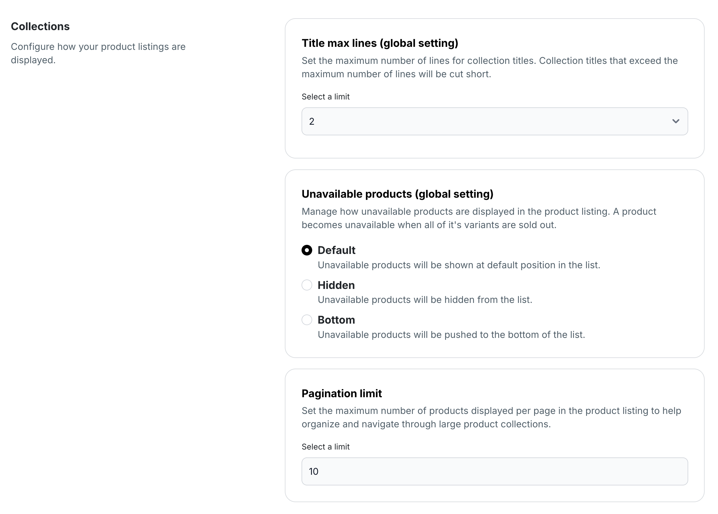
Title Max Lines
Choose how many lines appear for product titles across all collection views.
Select 1 line or 2 lines from the dropdown for a consistent look.
Unavailable Products
Decide how unavailable products appear globally on collection pages:
-
Default – keeps unavailable products in their usual position.
-
Hidden – completely hides unavailable products.
-
Bottom – moves unavailable products to the bottom of the list.
Collection display follows your existing Shopify configuration.
Pagination Limit
Set how many products display per page on your product listing pages.
You can:
-
Select a number using the counter input, or
-
Type a specific number manually.
This helps organize large collections and makes browsing easier for shoppers.
✅ Once all settings are configured, click Save to apply your changes. Your app’s product and collection pages will now reflect your chosen global display preferences.


